
The Psychology of Signage: How Colors and Fonts Influence Customer Behavior
When it comes to signage, design is more than just aesthetics—it’s a powerful tool for influencing customer behavior. Colors, fonts, and layout choices all play a role in how people perceive and interact with a sign. Understanding these psychological factors can help businesses create signage that not only grabs attention but also drives action.
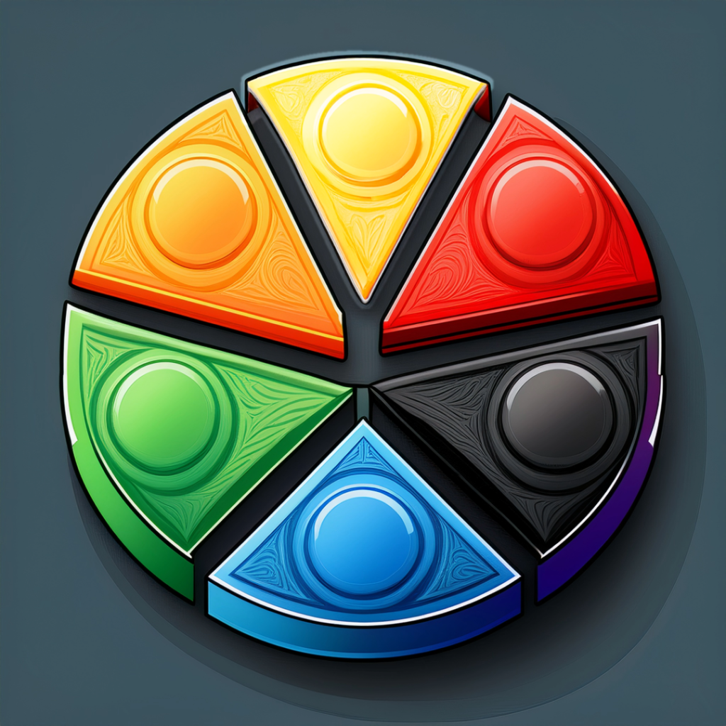
The Power of Color in Signage
Colors evoke emotions and reactions, making them a critical element of sign design. Here’s how different colors can impact customer perception:
- Red – Creates a sense of urgency and excitement, commonly used in clearance sales and fast-food branding.
- Blue – Conveys trust, professionalism, and calmness, often seen in corporate and financial signage.
- Yellow – Grabs attention quickly and stimulates positivity, frequently used for cautionary signs or promotions.
- Green – Associated with nature, health, and relaxation, commonly found in organic or eco-friendly brands.
- Black – Represents luxury, sophistication, and power, ideal for high-end branding.
- Orange – Energetic and enthusiastic, great for calls to action and impulse purchases.
Font Choices and Readability
Just like color, typography plays a crucial role in how signage is perceived. The right font choice can enhance readability and reinforce brand identity.
- Serif Fonts (e.g., Times New Roman, Garamond) – Convey tradition, reliability, and professionalism. They work well for luxury brands and formal signage.
- Sans-serif Fonts (e.g., Helvetica, Arial) – Modern, clean, and easy to read from a distance, making them ideal for digital screens and large-scale signage.
- Script Fonts (e.g., Brush Script, Lobster) – Elegant and personal but can be harder to read in certain settings. Best used sparingly for decorative purposes.
- Bold and Blocky Fonts – Create a strong impact, making them effective for headlines and urgent messaging.
Balancing Layout and Contrast
A well-structured sign ensures the message is conveyed quickly and effectively. Here are a few key considerations:
- Hierarchy Matters – The most important information should be the most prominent (e.g., store name, sale percentage, or call to action).
- High Contrast for Visibility – Light text on a dark background or vice versa enhances readability from a distance.
- Spacing and Simplicity – Cluttered designs are overwhelming. Ample spacing improves clarity and visual appeal.
Final Thoughts
By strategically using colors, fonts, and layout techniques, businesses can create signage that not only looks great but also influences customer decisions. Whether it’s a storefront sign, digital banner, or promotional poster, understanding the psychology behind design can make all the difference.
Looking to create signage that makes an impact? Contact My Graphics Pros for expert design solutions tailored to your brand!